Drop-In Pattern
One composable wraps your existing TopAppBar. Pass your contextual actions and you’re done — animated transitions, back-press handling, and M3 colors included.
Every Google app — Gmail, Photos, Files, Drive — has the same pattern: long-press an item, and the top app bar transforms into a contextual action bar showing the selection count, a close button, and action icons like delete, archive, or share.
Material 3 for Compose has TopAppBar. It has SwipeToDismissBox. It even has ActionMode for Views. But it has zero support for contextual action bars in Compose. You’re left manually swapping TopAppBar content with no animation, no back-press handling, and no structure.
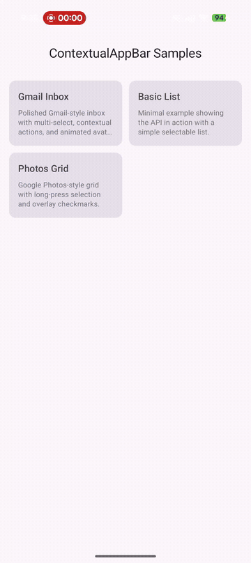
Gmail-style inbox demo running on Pixel 9 Pro Fold — long-press to select, tap to toggle, back to clear.
Drop-In Pattern
One composable wraps your existing TopAppBar. Pass your contextual actions and you’re done — animated transitions, back-press handling, and M3 colors included.
Compose Multiplatform
Works on Android, iOS, JVM Desktop, and WasmJs. Single API, single source set. Back-press handling adapts per platform.
Two API Levels
MaterialContextualTopAppBar for batteries-included M3 styling. ContextualTopAppBar for full custom control — bring your own bars.
Production Ready
Back press interception on Android, customizable animations, M3 primaryContainer theming, and binary-compatible API tracked with apiCheck.
[libraries]contextual-appbar = { group = "io.github.aldefy", name = "contextual-appbar", version = "1.0.0-alpha01" }commonMain.dependencies { implementation(libs.contextual.appbar)}commonMain.dependencies { implementation("io.github.aldefy:contextual-appbar:1.0.0-alpha01")}var selectedIds by remember { mutableStateOf(emptySet<Int>()) }
Scaffold( topBar = { MaterialContextualTopAppBar( selectedCount = selectedIds.size, onClearSelection = { selectedIds = emptySet() }, contextualNavigationIcon = { IconButton(onClick = { selectedIds = emptySet() }) { Icon(Icons.Default.Close, contentDescription = "Clear") } }, contextualActions = { IconButton(onClick = { /* archive */ }) { Icon(Icons.Default.Archive, contentDescription = "Archive") } IconButton(onClick = { /* delete */ }) { Icon(Icons.Default.Delete, contentDescription = "Delete") } }, defaultBar = { TopAppBar(title = { Text("Inbox") }) }, ) }) { padding -> LazyColumn(modifier = Modifier.padding(padding)) { items(emails) { email -> EmailRow( email = email, selected = email.id in selectedIds, onLongClick = { selectedIds += email.id }, onClick = { if (selectedIds.isNotEmpty()) { selectedIds = if (email.id in selectedIds) selectedIds - email.id else selectedIds + email.id } } ) } }}The transition is driven by a single value: selectedCount.
| State | selectedCount | What happens |
|---|---|---|
| Normal | 0 | Default bar shown |
| Selecting | > 0 | Contextual bar crossfades in, back press intercepted |
| Clearing | Back to 0 | Default bar crossfades back |
Under the hood: AnimatedContent with configurable ContentTransform, plus platform-specific BackHandler (Android intercepts system back, other platforms use the close button).
| Component | Purpose |
|---|---|
MaterialContextualTopAppBar | M3 convenience — wraps TopAppBar with primaryContainer colors, title slot, action slots |
ContextualTopAppBar | Raw wrapper — crossfades between any two composables you provide |
ContextualTopAppBarDefaults | Default colors and animation specs |
ContextualTopAppBarColors | Immutable color configuration for the contextual state |
ContextualAnimationSpec | Default crossfade animation (250ms fade) |
| Platform | Artifact | Back Press |
|---|---|---|
| Android | contextual-appbar-android | System back intercepted |
| JVM Desktop | contextual-appbar-jvm | Close button only |
| iOS | contextual-appbar-iosarm64 / iossimulatorarm64 / iosx64 | Close button only |
| WasmJs | contextual-appbar-wasmjs | Close button only |