M3 Spec Compliant
28dp corner radius, Level 1 elevation, drag handle, scrim, accessibility semantics — all per the Material 3 specification.
Google’s Material 3 spec defines Side Sheets as a core component for displaying supplementary content alongside the main UI. They shipped View-based SideSheetBehavior and SideSheetDialog in Material 1.8.0, but Compose has zero implementation — no first-party, no third-party.
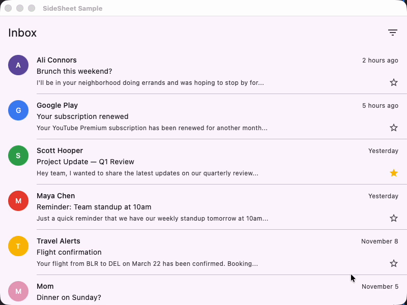
If you’re building a Compose Multiplatform app that needs a detail panel, filter sheet, or info overlay on tablets and foldables, you’re on your own. Until now.
M3 Spec Compliant
28dp corner radius, Level 1 elevation, drag handle, scrim, accessibility semantics — all per the Material 3 specification.
Compose Multiplatform
Works on Android, iOS, JVM Desktop, and WasmJs. Single API across all platforms.
Three Variants
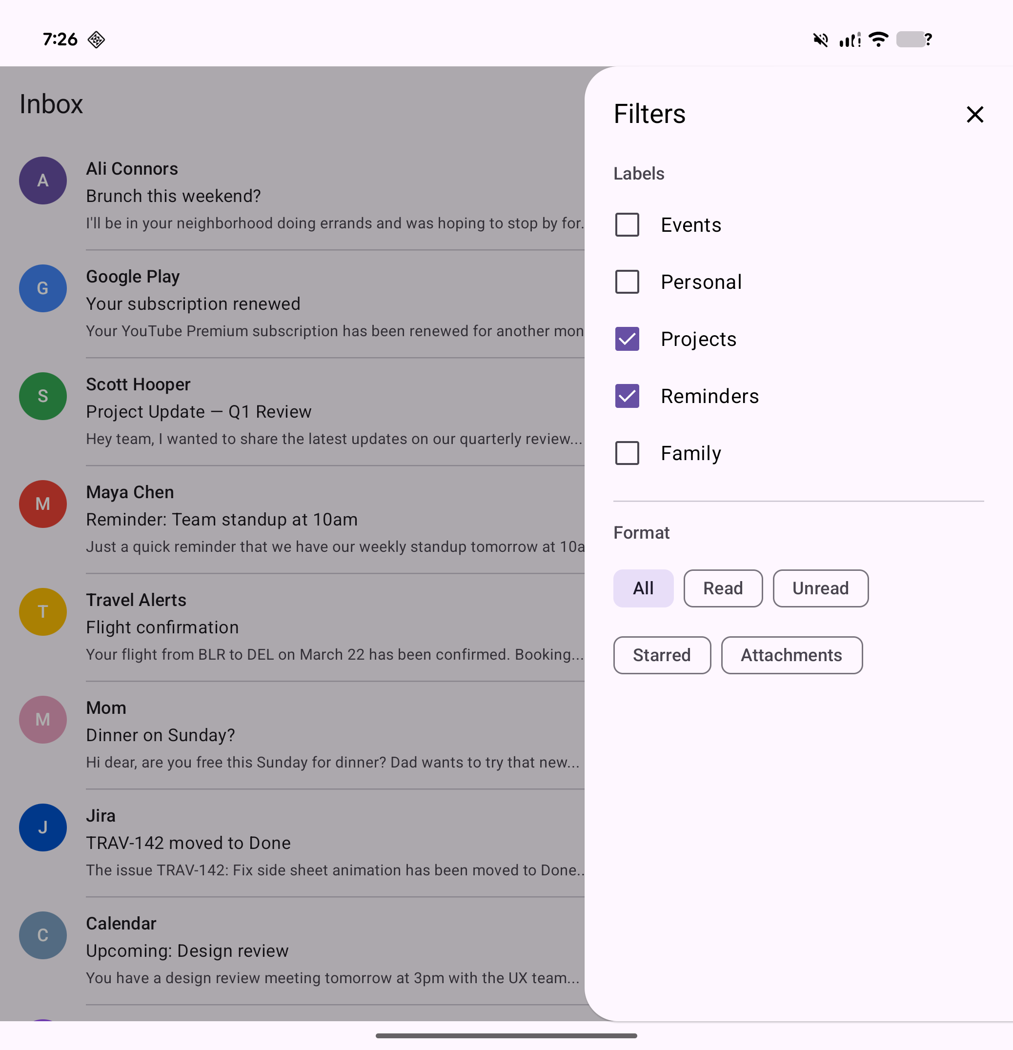
Modal (popup with scrim), Standard (inline, no scrim), and Adaptive (side sheet on tablets, bottom sheet on phones).
Fully Customizable
Every parameter has an M3-compliant default but is overridable — colors, shape, elevation, width, drag handle, edge, and gestures.
Compose Shelf is built entirely on compose.foundation — no Material dependency required. The core uses AnchoredDraggableState for physics-based swipe-to-dismiss, Popup for modal overlay, and BoxWithConstraints for adaptive layout switching.
| Component | What it does | When to use |
|---|---|---|
ModalSideSheet | Popup overlay with scrim + swipe-to-dismiss | Temporary detail panels, filters, settings |
StandardSideSheet | Inline panel, no popup or scrim | Persistent side panels on wide screens |
AdaptiveSheet | Side sheet on ≥600dp, bottom sheet on phones | Apps targeting both phones and tablets |
var showSheet by remember { mutableStateOf(false) }
if (showSheet) {    ModalSideSheet(        onDismissRequest = { showSheet = false },    ) {        Text("Sheet content", modifier = Modifier.padding(24.dp))    }}
// Side sheet on tablets (≥600dp), bottom sheet on phonesAdaptiveSheet( onDismissRequest = { showSheet = false },) { Text("Adapts to screen width", modifier = Modifier.padding(24.dp))}Row { MainContent(modifier = Modifier.weight(1f))
StandardSideSheet { Text("Always visible panel", modifier = Modifier.padding(24.dp)) }}| Feature | Status |
|---|---|
| 28dp corner radius (cornerLarge) | Implemented |
| Level 1 elevation shadow | Implemented |
| Drag handle indicator | Implemented |
| Scrim overlay (32% black) | Implemented |
| Swipe-to-dismiss | Implemented |
| Start/End edge with RTL | Implemented |
| Accessibility (paneTitle, dismiss) | Implemented |
| No swipe-to-open (per spec) | Correct |
| Platform | Artifact | Status |
|---|---|---|
| Android | shelf-android | Stable |
| JVM Desktop | shelf-jvm | Stable |
| iOS arm64 | shelf-iosarm64 | Stable |
| iOS Simulator arm64 | shelf-iossimulatorarm64 | Stable |
| iOS x64 | shelf-iosx64 | Stable |
| WasmJs | shelf-wasmjs | Stable |
Compose Shelf depends only on compose.runtime, compose.foundation, compose.ui, and compose.animation. It works with Material 3, Material 2, or your own custom design system.